Family and
Childcare Trust
CHARITY BRANDING
Through research, campaigning and practical support the Family and Childcare Trust works to make the UK a better place for families.
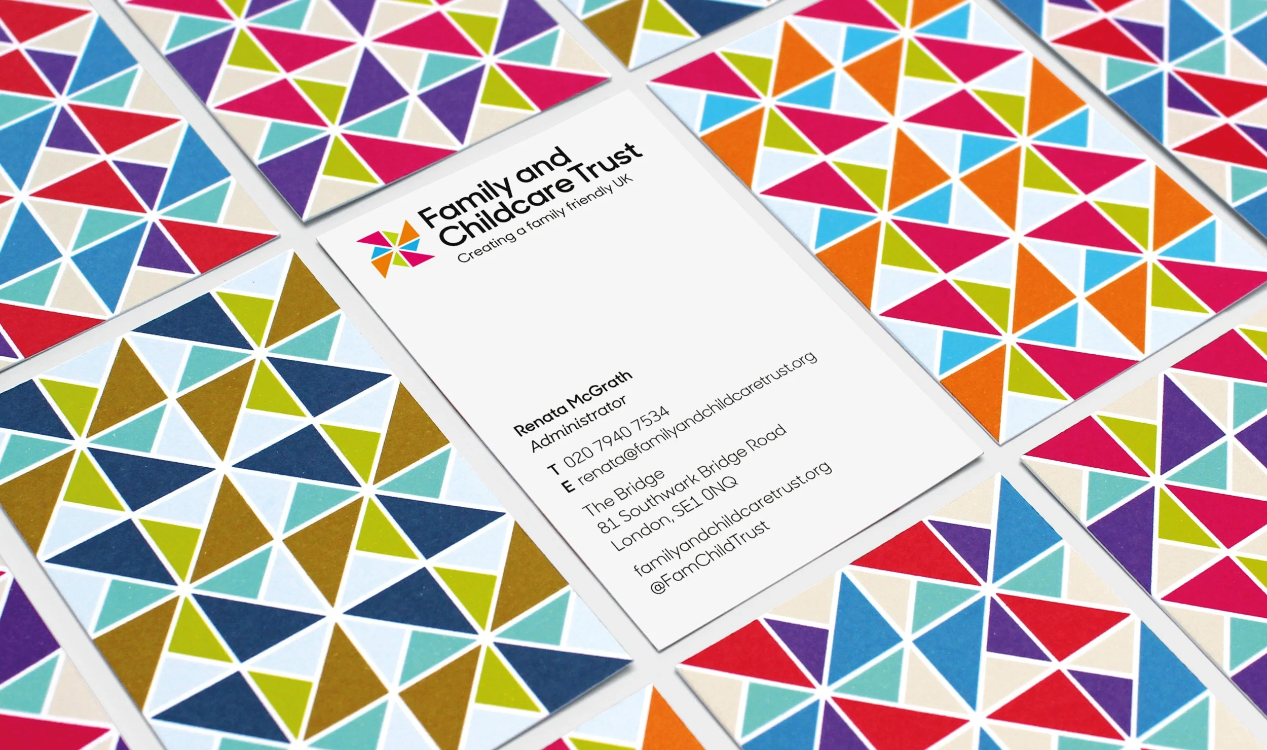
I devised a flexible and spirited brand identity to communicate the charities’ vision and activities to a diverse audience of policy makers and parents.
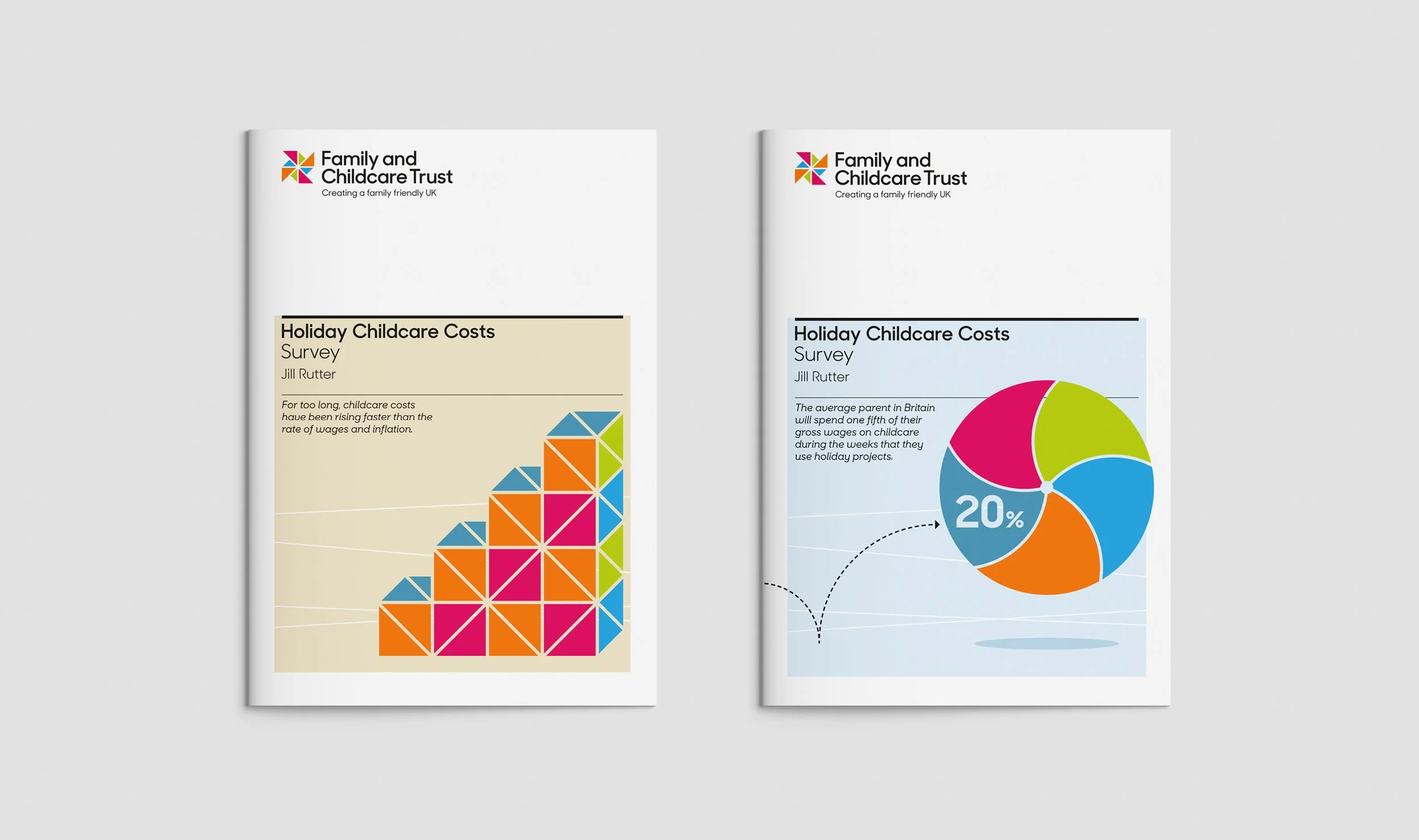
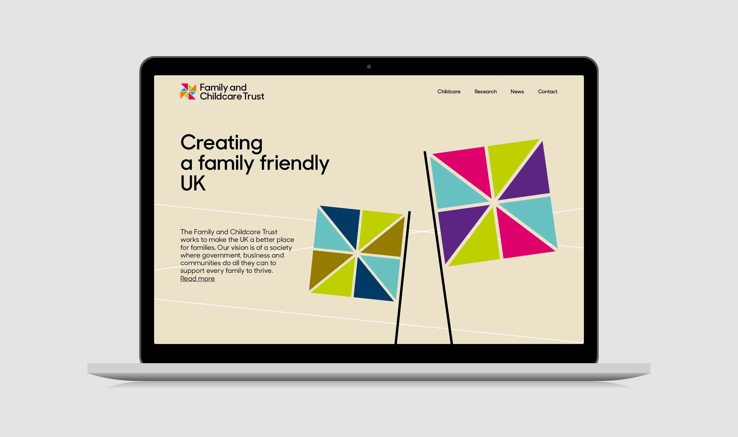
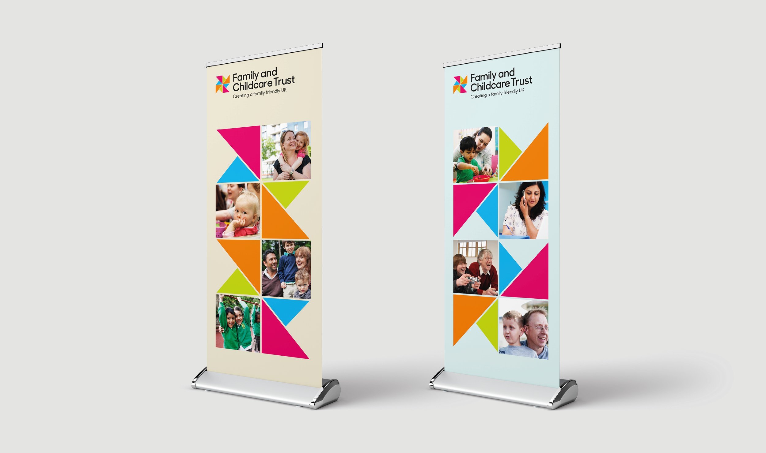
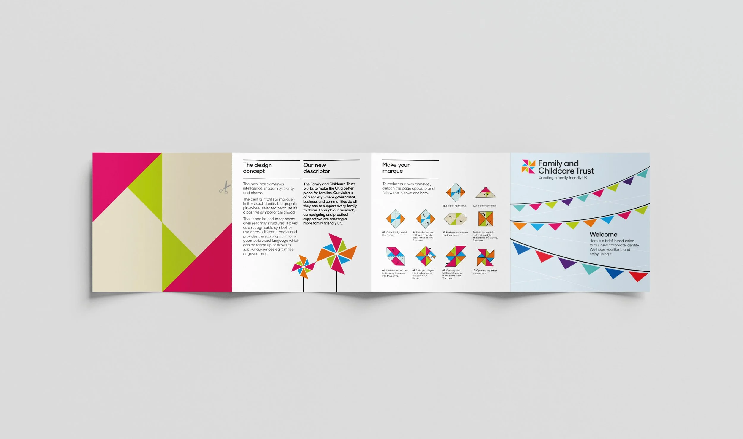
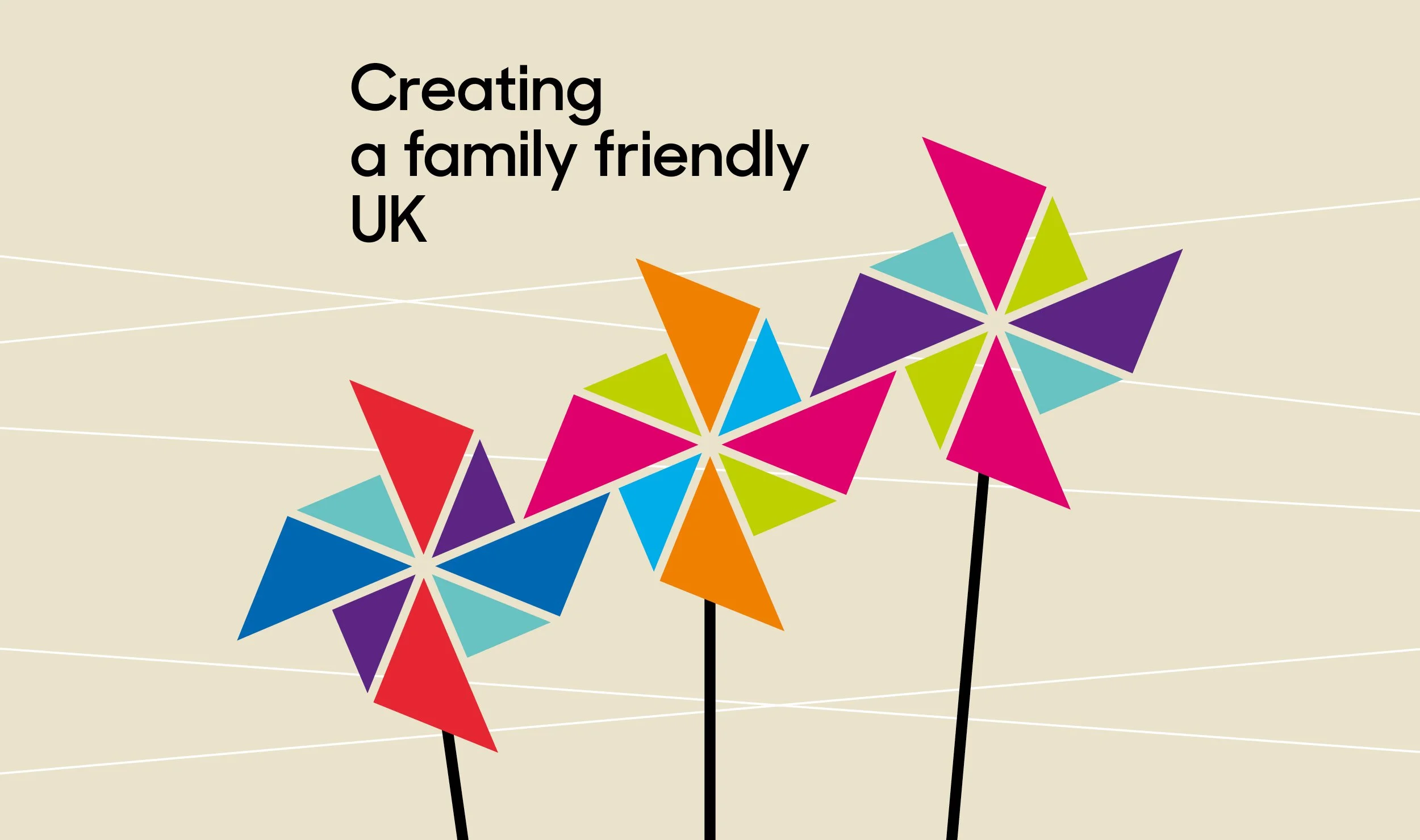
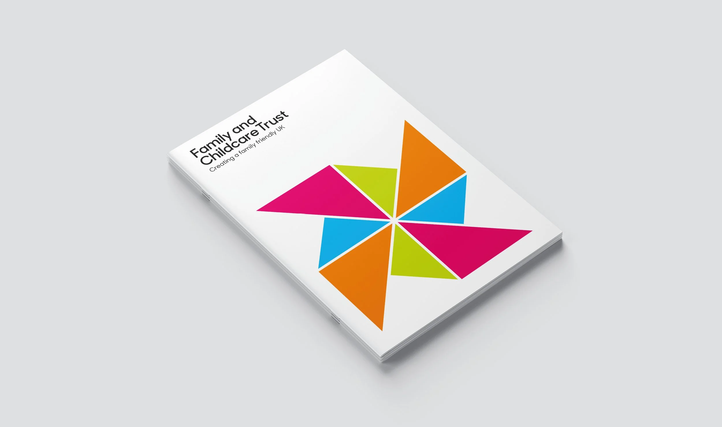
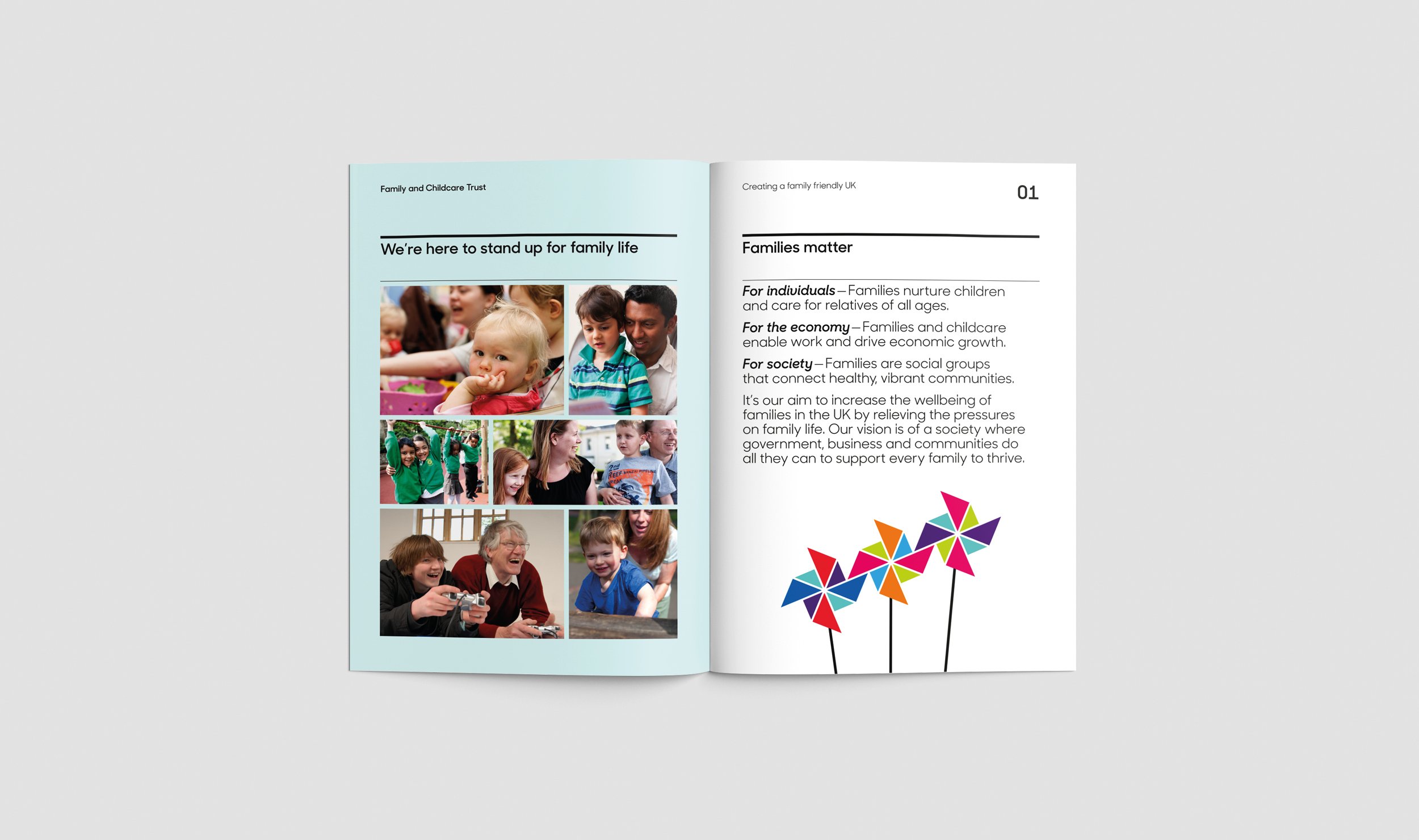
I liked the idea of using a graphic pinwheel as a positive symbol of childhood. The shapes within it were used to form a geometric visual language that combined gravitas with childlike charm.
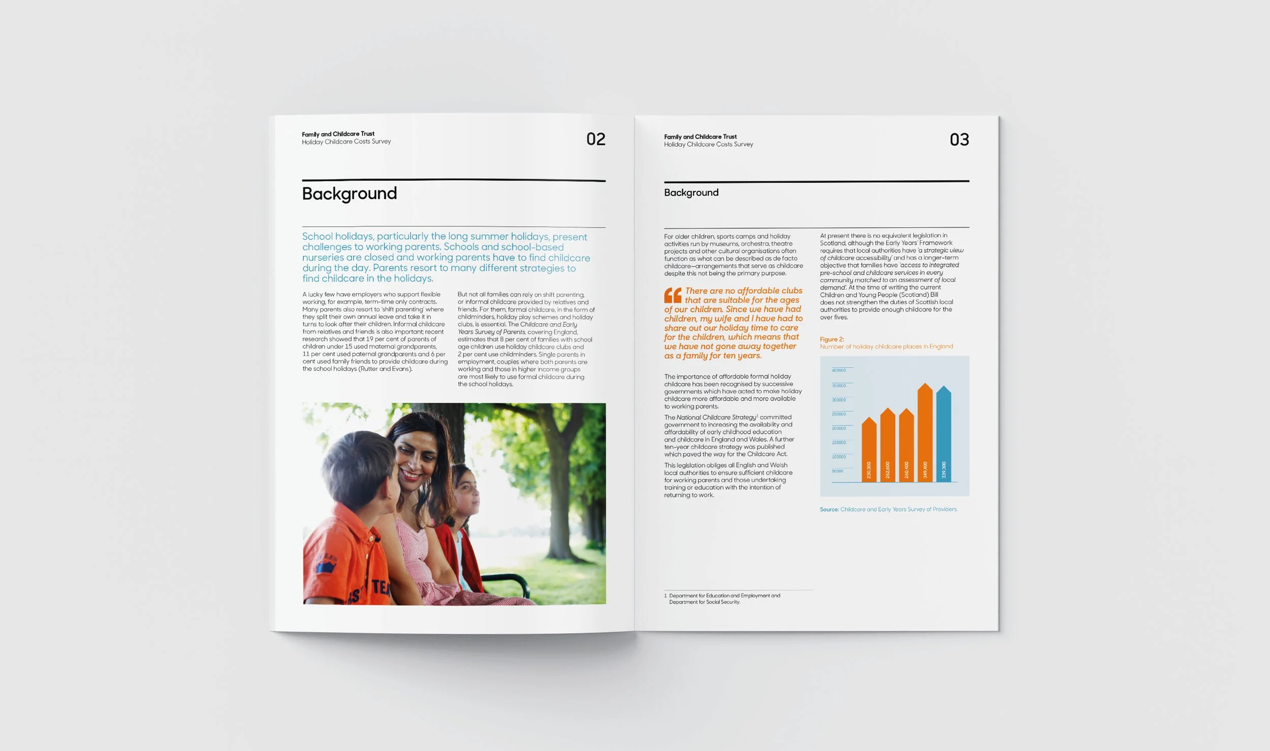
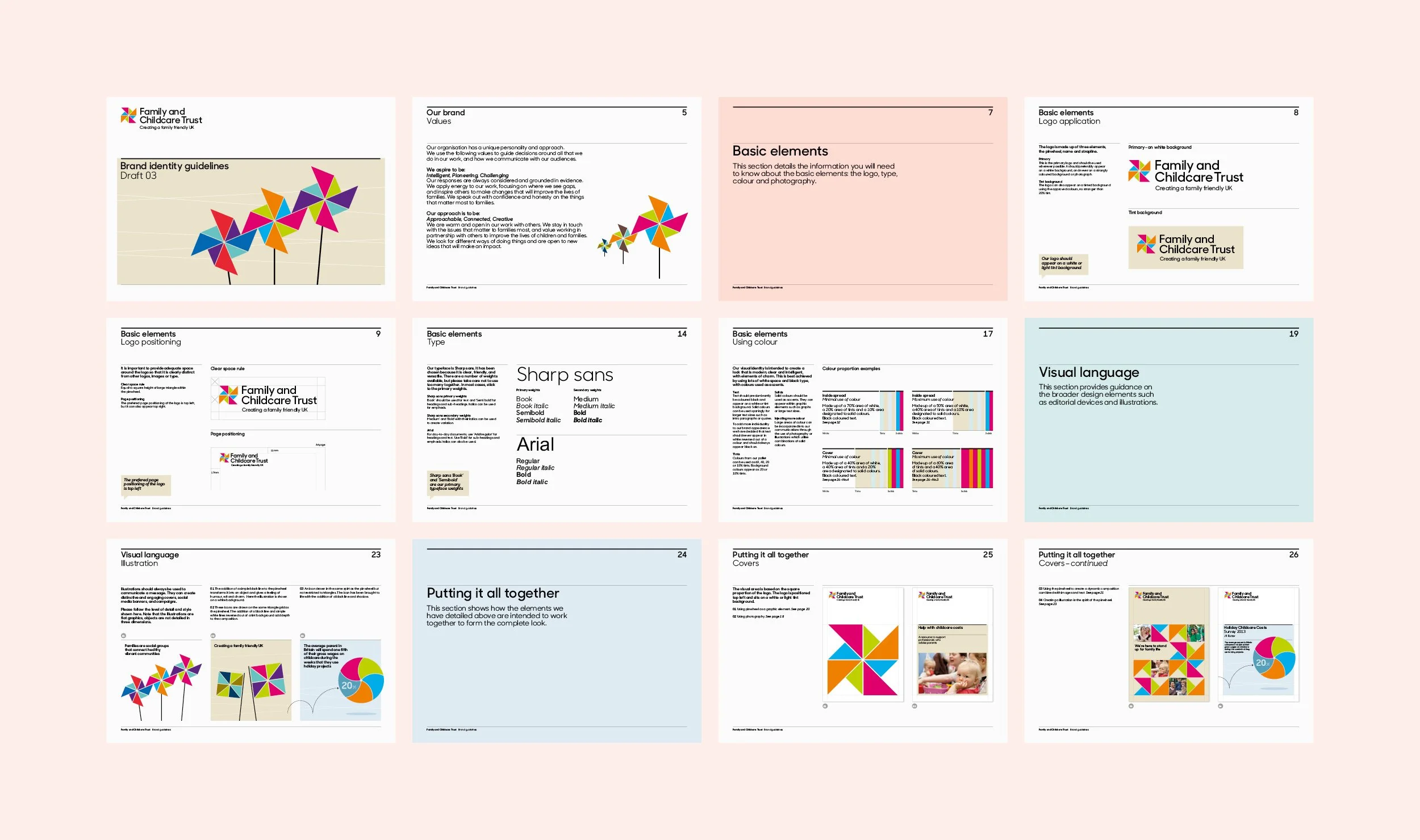
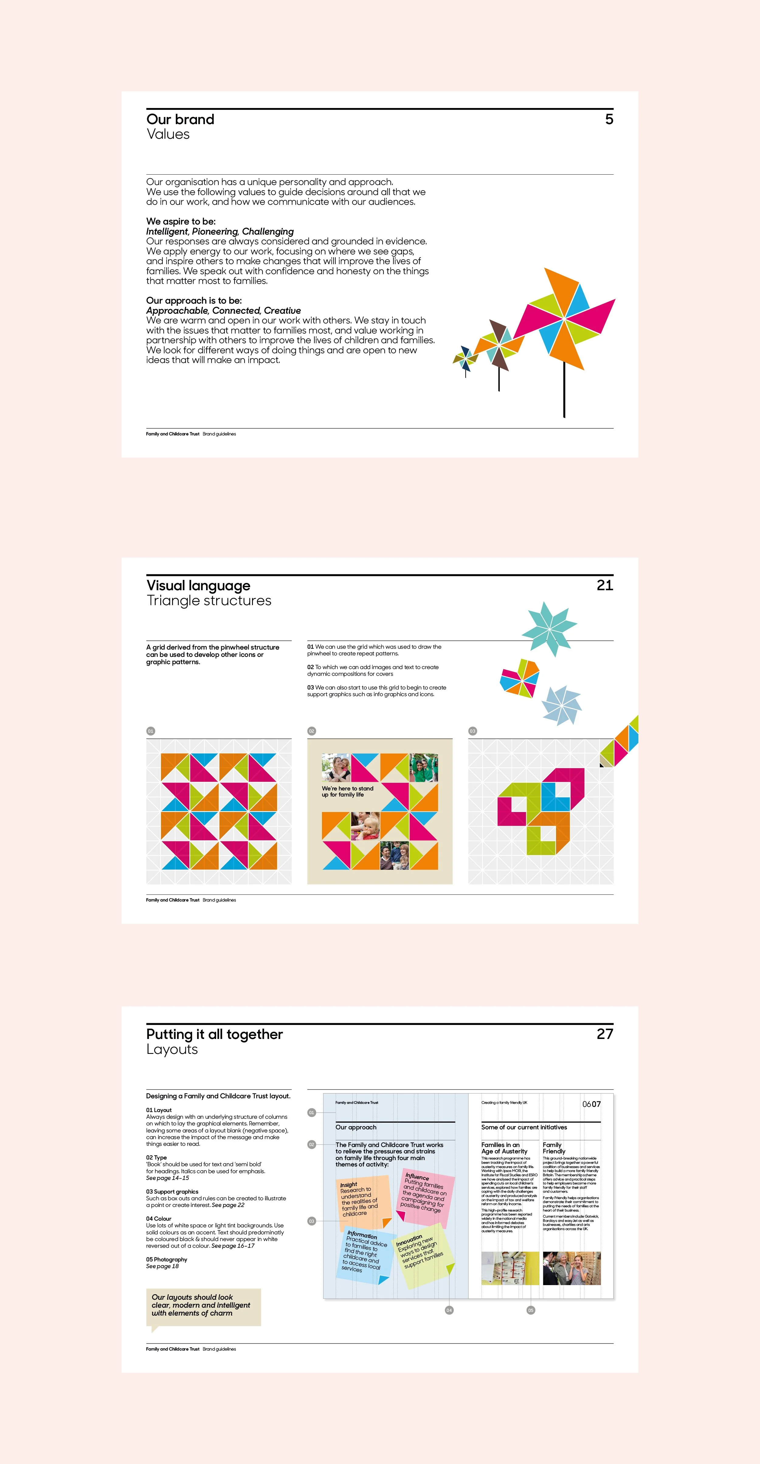
Applications included; website, strategy document, stationery, research documents, welcome leaflet and brand manual.
Working with: Colourful Design Strategy, Nick David Photography


I liked the idea of using a graphic pinwheel as a positive symbol of childhood. The shapes within it were used to form a geometric visual language that combined gravitas with childlike charm.